Skill Development Course
Enhance your professional competencies and employability
About The Course
Develop essential professional skills for career success
Overview
The Skill Development Course (SDC) focuses on enhancing the practical abilities, professional competencies, and overall employability of students. It bridges the gap between academic knowledge and industry requirements by developing essential technical, communication, and interpersonal skills. The course empowers learners to face real-world challenges with confidence and adaptability.
Communication Skills
Enhances verbal and written communication for effective interaction in professional environments and team collaborations.
Teamwork & Leadership
Develops the ability to collaborate, take initiative, and lead teams effectively in diverse professional settings.
Technical Skills
Focuses on hands-on learning in domain-specific tools, technologies, data visualization, and practical applications.
Critical Thinking
Encourages analytical thinking to identify, evaluate, and solve problems creatively in professional scenarios.
Time Management
Teaches efficient planning and organization to meet deadlines and manage workloads effectively in professional environments.
Career Readiness
Prepares students for job interviews, résumé writing, professional networking, and workplace etiquette.
Faculty Information
Meet your course instructor
Ms. JAVARIA BEGUM
Skill Development Coordinator
Lab Details
Practical sessions and schedule
Lab Incharge
Ms. JAVARIA BEGUM
Lab Schedule
THURSDAY - 10:50 AM TO 1:10 PM
Lab Location
SDC Lab - Main Building, 1st Floor
Practical Tasks & Solutions
Hands-on assignments with detailed solutions
SOLUTION:
What is Data?
Data refers to raw facts, statistics, or information collected or stored in a structured or unstructured form. Data can take various forms, such as text, numbers, images, videos, and more. It is the foundation of all information and knowledge and is used in various fields for analysis, decision-making, and understanding trends and patterns.
Data can be categorised into two main types:
Structured Data: This type of data is organized into a specific format, such as tables or databases, and is easily searchable and analyzable. Examples include spreadsheets, relational databases, and CSV files.
Unstructured Data: Unstructured data lacks a specific format and can include text documents, social media posts, images, audio recordings, and more. Analyzing unstructured data often requires advanced techniques like natural language processing and image recognition.
Where to Find Data?
You can find data from various sources, depending on your specific needs:
- Open Data Portals: Many governments and organizations provide free access to data through open data portals like Data.gov and data.gov.uk
- Data Repositories: Platforms like Kaggle, GitHub, and UCI Machine Learning Repository
- APIs: Twitter API, Google Maps API, and financial market APIs
- Web Scraping: Using tools like Beautiful Soup and Scrapy
- Surveys: Conducting your own surveys or questionnaires
Foundation for Building Data Visualization:
- Data Analysis: Thorough analysis to understand structure and patterns
- Statistical Knowledge: Understanding mean, median, standard deviation
- Domain Knowledge: Contextual understanding of the subject matter
- Visualization Tools: Matplotlib, Seaborn, ggplot2, D3.js, Tableau
- Design Principles: Color theory, typography, visual hierarchy
Creating Your First Visualization:
- Select Your Data: Choose a clean, well-structured dataset
- Define Your Objective: Clearly state what you want to communicate
- Choose Visualization Type: Bar charts, line charts, scatter plots, etc.
- Prepare Data: Preprocess and transform as needed
- Create Visualization: Use appropriate tools and customize
- Test and Iterate: Review for accuracy and clarity
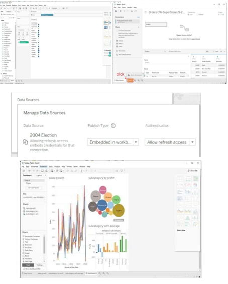
SOLUTION:
Getting started with Tableau software is a great way to create data visualizations quickly and efficiently.
Steps to Get Started:
- Download and install Tableau: Get Tableau Desktop or Tableau Public (free version)
- Prepare your data: Ensure data is in suitable format (Excel, CSV, text files)
- Connect Your Data to Tableau:
- Launch Tableau Desktop
- Go to "File" → "Open"
- Choose data source type and select file
- Drag table into working area
- Data Source Pane: Preview data and perform transformations
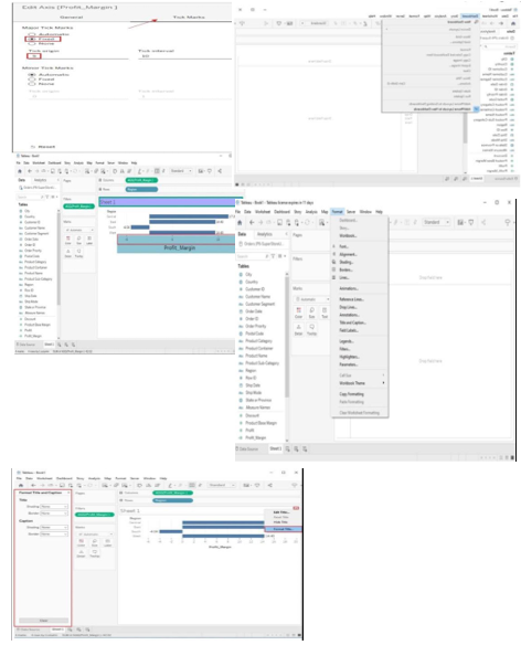
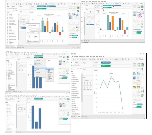
Creating Basic Charts:
Line Chart:
- Drag date field to Columns shelf
- Drag numeric field to Rows shelf
- Tableau automatically creates line chart
Bar Chart:
- Drag categorical field to Columns shelf
- Drag numeric field to Rows shelf
- Adjust orientation and formatting
Tree map:
- Drag categorical field to Columns shelf
- Drag numeric field to Size shelf
- Customize colors and labels
Using the Show Me Panel:
- After adding fields, click "Show Me" panel
- View recommended chart types
- Click on chart type to create it
- Tableau automatically generates the chart
- Click "Clear" to return to worksheet view
SOLUTION:
Tableau offers a powerful set of calculation tools that allow you to manipulate, transform, and analyze your data in various ways.
SUM and AVG (Average) Functions:
SUM FUNCTION: Calculates the total sum of a numeric field. Drag numeric field into "SUM" shelf or create calculated field.
AVG (Average) Function: Calculates the average value of a numeric field. Use similarly to SUM function.
Aggregate Functions:
Tableau provides aggregate functions for calculations on groups of data:
- SUM, AVG, COUNT
- MIN (minimum value)
- MAX (maximum value)
Useful for analyzing data at different granularity levels.
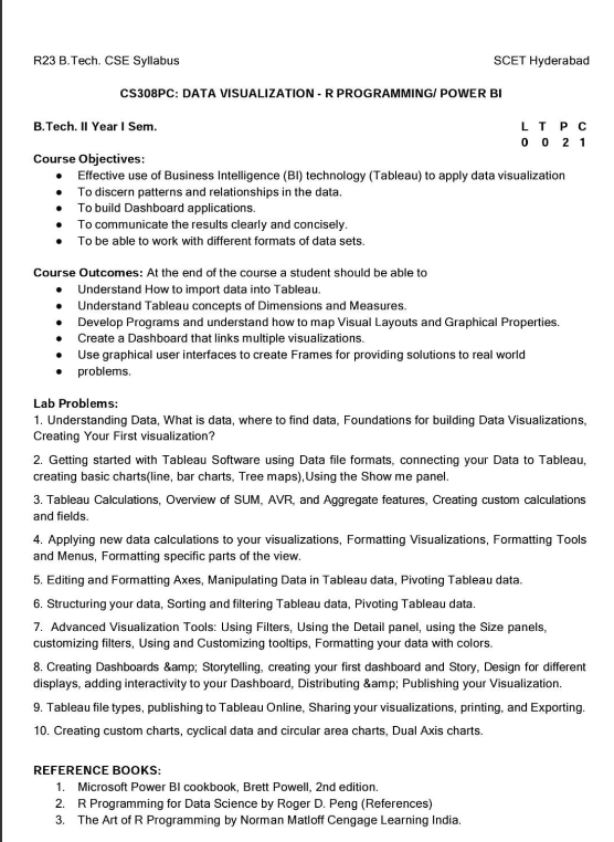
Creating Custom Calculations:
- Create a new Calculated Field: Right-click data source → "Create Calculated Field"
- Enter your calculation: Use functions, operators, and field references
- Name and save: Give meaningful name and click "OK"
- Use in Worksheet: Drag to shelves, use in filters, create visualizations
Example Calculation: Profit margin = (SUM([Profit]) / SUM([Sales])) * 100
SOLUTION:
Applying New Data Calculations to Visualizations:
1. Drag and Drop Calculated Fields: Simply drag calculated fields onto appropriate shelves in your worksheet.
2. Filter with Calculated Fields: Create filters using calculated fields to control which data points are displayed.
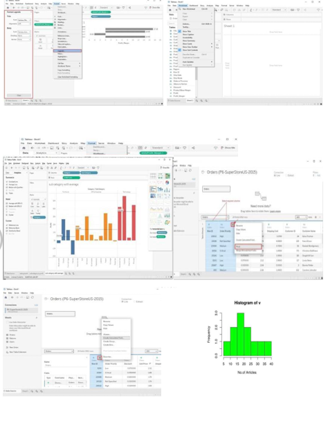
Formatting Visualizations:
1. Format Pane: On left side, format fonts, colors, lines, shading, and borders.
2. Marks Card: Above visualization, format specific mark types (color, size, label).
3. Axis and Gridlines: Right-click to format axis labels, titles, and gridlines.
4. Legends and Color Scales: Customize colors, labels, and legend positions.
Formatting Tools and Menus:
1. Format Menu: Access font styles, shading, borders, alignment at top of interface.
2. Worksheet Menu: Format entire worksheet including background, borders, title.
3. Dashboard Menu: Format entire dashboard layout, background, size, title.
Formatting Specific Parts of the View:
1. Annotations: Add and format annotations to highlight important points.
2. Tooltips: Customize tooltips to display relevant information on hover.
3. Headers and Titles: Format for clarity and consistency using Format pane.
SOLUTION:
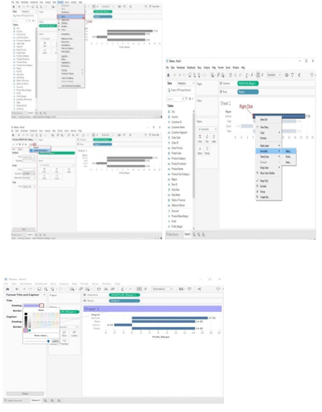
Editing and Formatting Axes:
1. Edit Axis Title: Click axis title to modify text, font, size, color, alignment.
2. Edit Axis Labels: Right-click axis → "Edit Axis" to modify labels.
3. Scale and Range: Right-click axis → "Edit Axis" → adjust Minimum, Maximum values.
Manipulating Data in Tableau:
New Column (Calculated Fields): Use calculated fields for customized logic using Tableau's extensive function library.
Pivoting Tableau Data:
Data pivoting enables you to rearrange columns and rows in a report to view data from different perspectives.